Building the GlitchTip identity
Building a brand is an important part of launching a product. How important is certainly a matter of debate. But ultimately, a good identity conveys professionalism, which builds trust. A good name and brand can do a lot of marketing work for you if you do it right.
We want to share some of our process. If you're looking to build an open source product, feel free to use any insight here to help you build your brand.
Picking "GlitchTip"
When we decided we were going to do the project, we needed a name. Naming is fun, and also a bit stressful. We initially looked at "Error Canary" or "Canerry". The "canary in a coal mine" is an early warning of danger, so it was really strong conceptually. But the former felt a bit unwieldy, and the latter seemed like something that was never going to be spelled correctly.
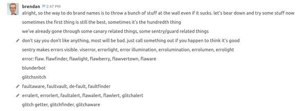
A brainstorming session ensued. "Sentinel" was being kicked around, but if I recall correctly, it wasn't unique enough. So I started a brainstorming session:

Something like "Errolight" felt too "corporate" for my personal tastes. We loved "Flawvertown" and continue to joke that it should have been the winner. But on a more serious level, I was the most interested in "GlitchSnitch". I'm a sucker for rhymes, and it's clever. However, it didn't feel like a real brand name to me, and there's some baggage with the word "snitch" that we preferred to avoid.
We bounced around more ideas, many of which were focused on a glitch. Glitchget, glitchbot. Since we like rhymes and alliterations, we played with those too: Flopfind, Bugbuffer, Flawflare, Wartwatch.
Looking back on the group chat, I found this, which was the first mention of what became the new brand:
I like glitchguard, though it doesn’t technically do that. glitchalarm. glitchtip. glitchflag. glitch signal, glitch sos. mayday. siren
Glitchtip is the kind of name I like. short, catchy, descriptive, unique
I started to push for it. The final names that we had on our radar were: Error Canary, GlitchTip, Mayday, Bughorn, and Blunderbot.
I didn't like Error Canary; too unwieldy. And in hindsight, it would have boxed us in because GlitchTip does more than report errors. Mayday sounds great, but would have been an uphill battle from an SEO perspective. Bughorn was safe and workable, but not as "grabby". Blunderbot is fantastic to say, but ultimately I wasn't sure how it'd work conceptually.
Eventually, GlitchTip won out, and a product name was officially born.
Making the logo
A name is one part of a brand. The next part is a logo.
I'm of the opinion that, unless you have a big budget or are really looking to make a splash, a good logo can be relatively restrained as long as it's competently executed. Also, one thing that tends to get lost: a logo doesn't have to do all of the work on its own. Think of a brand like Apple: the logomark itself is simple and largely forgettable; the brand is strong because of how they deploy it.
When I was thinking about brand visuals, I noted a little bit of a trend with glitchy imagery. Synthwave was on the scene too, and it has a particular set of visuals that I thought we could draw from without dating ourselves.
There was a challenge with using glitchy imagery, though: "glitches" are inherently things that are broken or bad. You definitely don't want to give the impression that your brand is broken or bad.
Put all of that together, and I had the parameters for my logo work:
- Don't spend a ton of time on it
- Make something that can integrate into a larger future branding effort
- Be glitchy, but not overly so
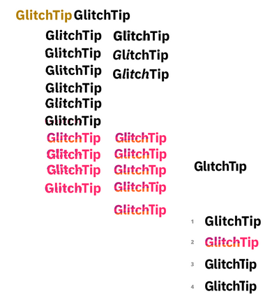
Here's a screenshot from my early work:

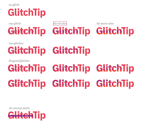
And here's what the refinement looked like:

As you can see, I dialed into a concept pretty quickly, and more time was spent on refinement than trying wildly different things.
Once I got some feedback, we settled on the logo that is in use today.
Building the brand
A brand is more than a logo. It's also colors, layout, illustration, messaging, and more.
Colors
For the purpose of getting a product launched, we needed to at least have an idea of what the color palette was going to be like.
We ended up picking a primary color that's a shade of red. We liked that red was the color because red has a strong association with errors, which is a big part of what GlitchTip does. However, we had a similar problem when working with glitches: since red is an error or danger color, we didn't want it to be too harsh. That's why we softened it up a bit.
The two main people working on brand stuff were Emily and me. Emily loves purple, and my favorite color is orange. Since those colors are on either side of red in the color wheel, and since they all look good together, that's the main reason why the palette ended up including those colors. We intentionally limited our use of purple because that's Sentry's primary color, and we didn't want to create brand confusion (more on that in a bit).
Those colors formed the basis of the logo, then the project-specific "G" logos, then were inserted into the marketing site as well as the frontend repo.
Brand voice
We're an online company, so we have to be online. That means having social media accounts, doing advertising online, that sort of thing.
Personally, I'm not a fan of brand-run accounts. I don't want GlitchTip to be like the more notorious consumer brands on Twitter, and I suspect our potential customers don't want us to be that either. So we've tried to adopt a brand voice that's minimal, informative, and not much else.
This could change over time. I could see the brand accounts advocating for self-hosting and/or open source. But I've seen plenty of corporate blogs that exist only to exist, and I'd want to be careful that we don't turn into that.
Messaging
Approachable, trustworthy, friendly. This is the balance we're trying to achieve.
Technology can be scary, even for people who often know what they're doing. So we think it's important to make design decisions that make our product feel more approachable. This manifests in a lot of ways: colors, informal copy, ease of onboarding, and style of illustrations. Perhaps more. If users don't think they can use the product, they won't. And good messaging/design can be reason enough to try something new.
At the same time, we're providing a service that is important. Users need to be able to trust that it'll handle their problems, and work when it's needed the most. Therefore, we have to be careful not to come off as too informal or unserious.
Design and the law
GlitchTip was started as a open source, drop in replacement to Sentry when their backend went proprietary. Since we're building a product that uses their open source work without working directly with them, we had legal concerns in our mind throughout the process.
I started my career as a graphic designer, and I feel strongly about the importance of respecting copyright and intellectual property (something that will, at times, put me at odds with the open source community).
That said, I spent the first few years petrified of violating someone's rights before I realized what things are like in the real world.
What I learned over time: Anyone can threaten legal action at any time, for any reason. Do they have a case? Doesn't matter, especially not at the cease-and-desist stage. Some people see a violation and choose not to go down the legal road, and other people see no violation and go down that road anyways. Legal action can bury you, or it can give you a ton of attention in a Streisand Effect type of scenario. I've even seen a case where it seemed like the company was happy to copy directly because it gave them a better product in the short and long term, they got a ton of media attention in the medium term, and the revenue was higher than the legal fees.
All of that to say: This stuff can be scary, there are things you can do to protect yourself, and doing the right thing will hopefully always lead to the best outcomes, but you can't let fear of what might happen paralyze you.
What are the kinds of legal concerns that you should be aware of if you get into this kind of work? This isn't a comprehensive list, but here are some notable concerns:
- Direct theft of assets. You can't just copy and paste stuff from Google. Any work that you see online should be assumed to have a copyright, unless you see a license that says otherwise. Could be public domain or Creative Commons, or maybe you find a free stock photo site that has a terms page you have read and understand. Know what the license is before you take it.
- Indirect theft of assets. If I copy a very distinctive picture, my copy could be seen as an illegal derivative work. But if I copy someone's take on a very common image (something like a save icon, or a straightforward drawing of the Washington Monument), it gets murkier. Some assets can only be done so many different ways, and for plaintiffs to win a case, they'd have to be able to prove that you copied their work intentionally. This kind of proof is more difficult for common themes.
- Violating trademarks. In the United States, you don't have to register with the USPTO in order to get trademark protection. But doing so gives you more options at the national and international levels. Regardless, one common misconception is that there can only be one company using a brand name. This, more often than not, is not true. If you started a company called "GlitchTip" that sold stationery at card stores, and if your brand didn't look like ours (more on that in a minute), we could probably coexist. We don't make stationery, you don't make error trackers, and so we don't ever really end up crossing paths. A great example to learn more about this is Cracker Barrel, the cheese and Cracker Barrel, the restaurant. They coexisted peacefully until the latter wanted to sell in grocery stores, which caused a bunch of legal action.
- Creating brand confusion. Apart from the legal/ethical question of intellectual property theft, this is the other big question. Did you create a brand that makes people think that your product is the same as another company's product? You'll generally be walking a line when you do design work: you don't want your site to be so unlike your competitors that it is unapproachable or hard to use. But if your site ends up looking too much like theirs, that could be trouble, especially if someone is able to prove intent to copy, or if surveys back the claim.
That's a lot of words, and I could write more. But the one-sentence summary is simple: Do your own work, and try not to look like your competitors. If that's your approach, you have a great chance of things going fine for you.
But what happens if you get the attention of a competitor's legal team? I have less experience here, but here are some quick thoughts:
- Getting a letter does not mean that you're getting a lawsuit.
- Getting a letter doesn't mean that you've done anything wrong.
- You might have to act as though you did something wrong, even if you didn't.
There's no one-size-fits-all advice here. Every situation is different, and everyone has different levels of risk tolerance, cash to spend, and quality legal assistance.
Remember, I am not a lawyer. Use this advice as a starting point for your own research and draw your own conclusions, and do nothing more with it than that.